Most “set a goal and you’ll achieve it” advice is folk wisdom. Gintarė wanted to test it properly. Her bachelor’s thesis asked a simple question: does setting a goal — and having someone in your corner — actually change the outcome over a month?
Answering that meant building something more than a typical Google Form. Each participant gets randomly assigned to one of three groups: control, momentary (message a support person in the moment of resistance), or weekly (a scheduled check-in cadence). The questions they see, the number of steps they go through, and the summary they receive at the end all branch based on that assignment. Same survey, three different experiences.
The form isn't a vessel for the experiment — it's part of it.
The decisions about scale length, friction, mascot timing, and email cadence all shape the data the thesis is built on. This case study walks through how.
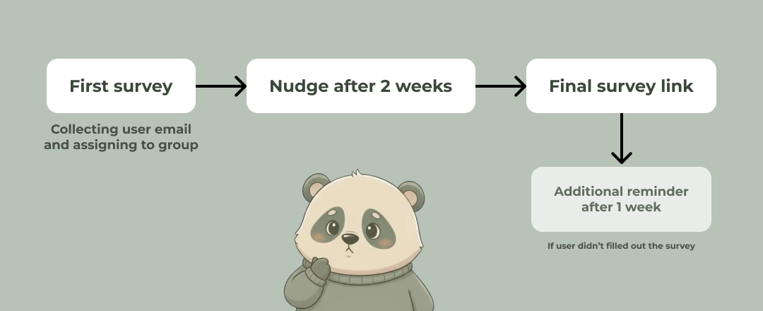
After submitting, the user gets a personalized email with their goal and the next step for their group. Then they go execute — for a month. Two weeks in, we send a nudge: a reminder of the goal they set, and permission to be imperfect about it. At four weeks, a second survey lands in their inbox to capture how things actually went. If they ghost us, a reminder follows a week later.
Starting with the first thing every participant sees.
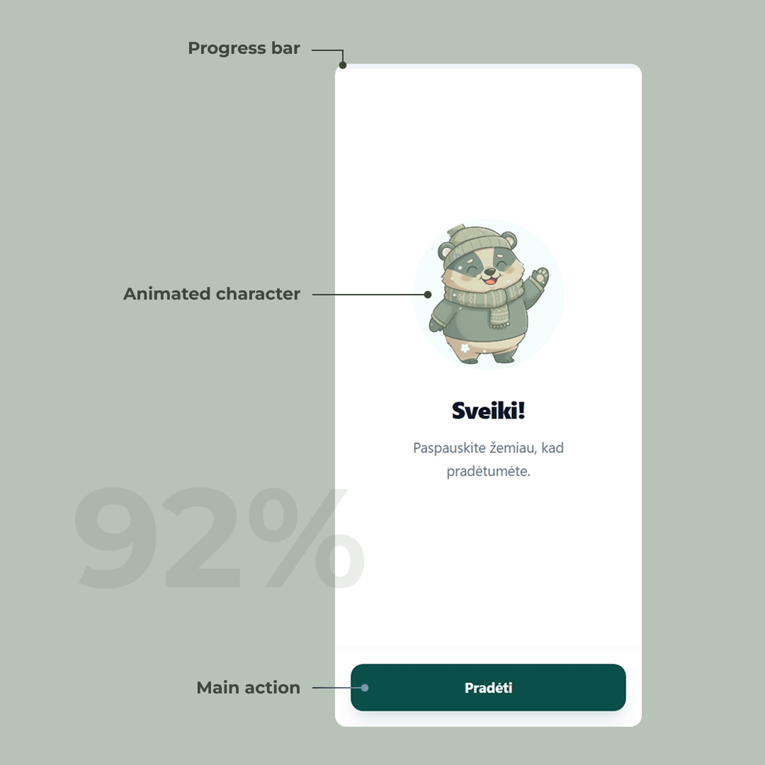
The welcome screen
The landing page of a survey sets the tone for the entire experience. Before the user has invested any effort, we’re telling them: this isn’t another boring form. The mascot waving from the top makes that promise visually — it adds personality, lowers the stakes, and starts building trust before a single question is asked.
The other pain point with forms is not knowing how long they’ll take. A progress bar pinned to the top fills left to right as the user advances, so the finish line is always visible. No surprises, no “wait, how many more pages of this?”
The layout is built mobile-first, with the primary action positioned in easy thumb reach. That call turned out to be the right one: 92% of users filled out the form on mobile.
The consent screen
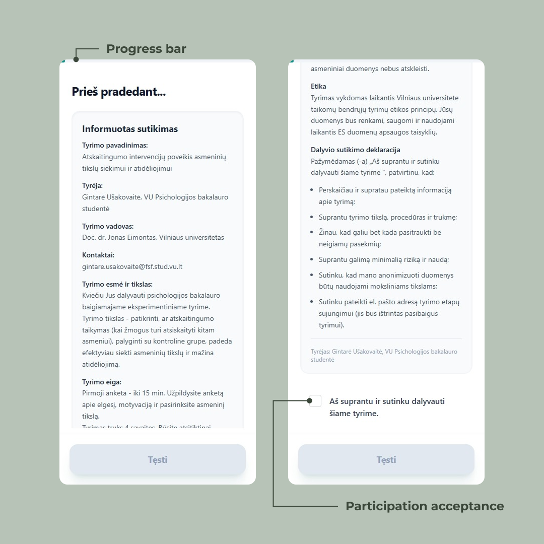
Psychology studies have ethics requirements. Before anyone answers a single question, they have to read what the study is about, what’s being collected, what their rights are, and explicitly agree to participate. This isn’t optional — it’s a hard requirement from the university’s ethics board.
The challenge: how do you make someone actually read a wall of text on a phone screen?
We could have hidden a checkbox at the bottom and called it done. Most forms do. But “I agree” loses its meaning when the user scrolls past everything to click it. So we designed the screen to make the reading itself part of the flow.
The “Tęsti” button sits at the bottom in a disabled state from the moment the screen loads. Users can see it — they know where they’re heading — but they can’t reach it without scrolling. The text cuts off mid-sentence at the fold and a visible scrollbar tells them there’s more below. Two quiet signals saying: keep going, you’re not done.
Only after the user reaches the bottom and ticks the checkbox does the button activate. The interaction is binary: read it, agree, continue.
It’s a small piece of friction, intentionally placed. Ethics compliance and good UX usually pull in opposite directions — here they’re doing the same job.
Try it yourself
The interaction is simple: you can’t proceed without reading and agreeing. Tick the box to see the button unlock.
Button states
The four button states across the form — start, continue, complete, and the loading state during validation.
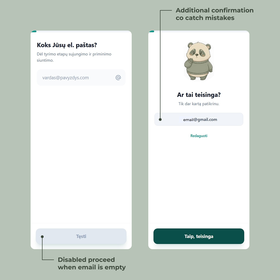
Capturing the email — twice
The email isn’t just a contact field. It’s the thread that holds the entire study together. We use it to send the post-survey summary, the two-week nudge, the link to the final survey, and the late-reminder if they ghost us. Get it wrong here and the participant silently drops out of the data set a month later.
So we ask for it early — second screen, right after consent — and we ask for it carefully.
Two things happen behind the scenes the moment they hit “Tęsti.” First, the email gets validated server-side against a standard regex. If it’s malformed, the user can’t progress. No “looks like you forgot the @” toast — just a hard stop, because anything less invites typos. Second, the email gets saved immediately as a partial submission. From this point on, the user’s progress is persisted. Close the tab, lose signal, swap devices — the form remembers them.
Then comes the part most forms skip: a confirmation screen.
The mascot reappears with a slightly worried expression — “Ar tai teisinga?” — and we show the email back to the user in plain text. Two options: confirm it, or hit “Redaguoti” to fix it. It costs one extra tap. In exchange, it catches the gnail.com, the missing letter, the autocomplete that filled in the wrong address from three months ago.
This is the kind of friction worth adding. A one-month longitudinal study is unforgiving — there’s no second chance to reach a participant whose email bounced on day one. Better to spend a tap now than lose a data point later.
The survey begins — and the mascot starts paying attention
This is where the actual study begins. From here on, the participant works through a mix of question types — single choice, sliders, open-ended — branching by group. Some users get a longer path, some shorter. Some see questions others never will. The form remembers where they are and saves as they go.
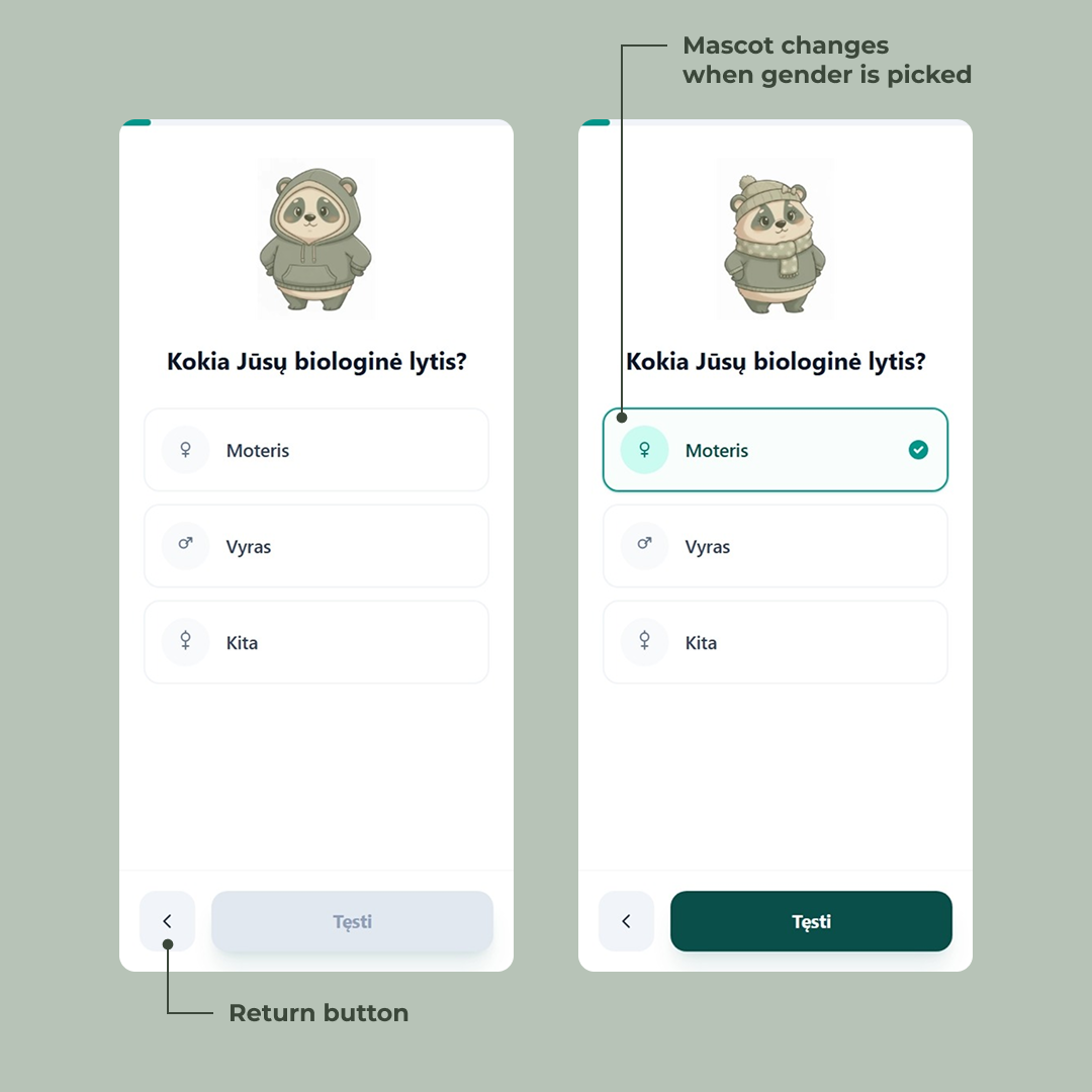
The first real question is biological sex. On the surface, it’s a standard single-choice picker — three options, gender symbols on the left so the choice is scannable before you’ve even read the label. A back arrow appears in the bottom-left, because from this point forward, users can revise.
But look at the mascot.
On the previous screens it was a generic panda — friendly, neutral, just there to humanize the flow. The moment the user taps “Moteris,” the mascot updates. Sweater, scarf, little knit hat. Tap “Vyras” and it shifts again. The character isn’t decoration anymore — it’s reflecting the participant back at themselves.

Kokia Jūsų biologinė lytis?
It’s a tiny detail. Most users probably won’t consciously notice it. That’s the point. The mascot quietly signals we’re paying attention to you without ever saying so, and the survey starts feeling less like a form and more like a conversation. The same trick — small, deliberate visual feedback tied to user input — shows up throughout the rest of the questions, in different forms.
A mascot for a question
The mascot doesn’t react to answers, but it sets the stage for them.
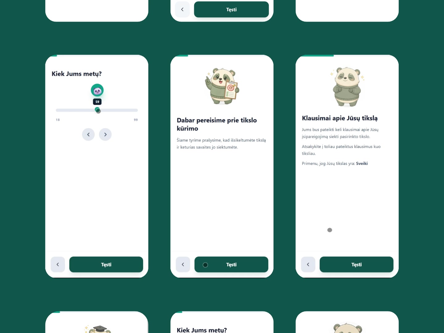
Each question has its own version. For education, the panda wears glasses, holds a book, and brandishes a little wand — a scholar costume that tells the user this section is about your background before they’ve even read the question. For age, the mascot shrinks down into the slider handle itself, riding along as the user drags from 18 to 99.
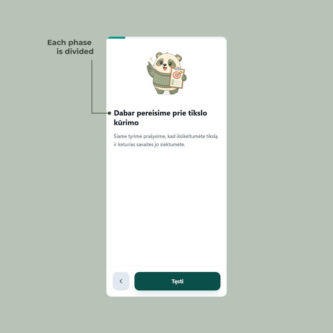
For the goal-setting section, the panda holds up a clipboard with a target on it — signaling we’re about to do something different now.
That last one is doing real work. The survey isn’t one flat list of questions; it has phases — demographics, then goal-setting, then the questions that vary by group. Without a visual cue, those transitions blur together and the participant just feels like the form is dragging on. The mascot-led intro screens act as chapter breaks. They give the user a moment to breathe, signal a shift in topic, and quietly answer the question how much more of this is there? before it gets asked.
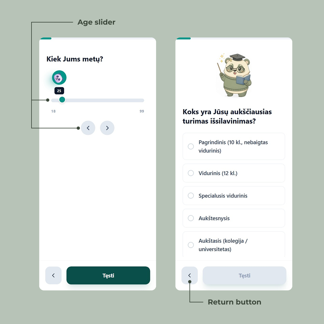
The slider screen is worth a second look on its own. Sliders are awkward on mobile — fat fingers, imprecise drags, and the value you’re picking is often hidden under your thumb. So the current age sits in a tooltip above the handle, always visible. Two arrow buttons below let users nudge the value one year at a time when the slider overshoots. The mascot riding the handle is the charm; the tooltip and the arrows are the actual usability work.
Setting a goal, one constraint at a time
Most forms treat “what’s your goal?” as a single text input. Type something. Hit next. Done.
That's not a goal. That's a wish.
The whole point of the study is to measure whether structured goal-setting actually changes outcomes — which means the goal itself has to be structured. A vague “get healthier” or “read more” won’t survive contact with a four-week deadline. So instead of one text field, we built the goal into a multi-step micro-flow that walks the user from a rough idea to something concrete enough to actually do.
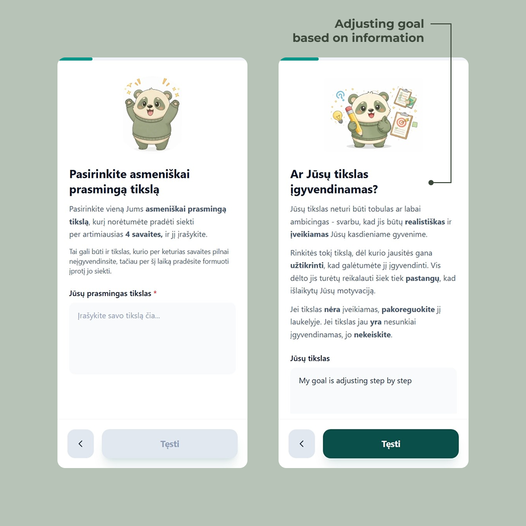
It starts soft. The first screen — Pasirinkite asmeniškai prasmingą tikslą — just asks for a goal that matters to the user personally. The supporting text gives them permission to pick something they won’t fully complete in four weeks, as long as they can start building the habit. Low pressure. Get them to commit to something.
Then the screens tighten the screws. Is the goal realistic? The next step asks the user to look at what they just wrote and judge it themselves — adjust it if it’s not achievable, leave it alone if it is. We don’t tell them what counts as realistic; we hand them the criteria (achievable in daily life, requires effort but not enough to kill motivation) and let them rewrite their own input. The text field reappears, pre-filled with what they typed before. The goal isn’t replaced — it’s refined.
More steps follow the same pattern: each one introduces one constraint, lets the user revise, and moves on. Specificity, time-bounding, what counts as “done.” By the end, the user has written and rewritten their own goal several times. It’s still theirs — but it’s now a goal that can actually be measured a month later.
This is the part of the form that’s doing the most science. Everything else captures data; this part shapes what gets captured. A four-week longitudinal study lives or dies on whether participants set goals concrete enough to evaluate. So the form takes its time here.
Likert scales, but readable
After the goal is locked in, the form moves into the measurement phase — the part of the survey that gathers the data Gintarė will actually analyze. A new chapter break sets it up: the mascot reappears with the user’s own goal repeated back at them in bold (“Primenu, jog Jūsų tikslas yra: My goal is adjusting step by step”), as if the form is checking in. Stay with us. This is what you said you’d work on.
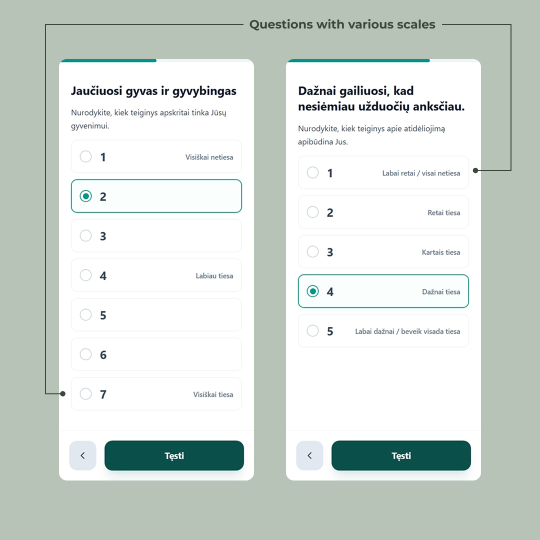
What follows is a long stretch of Likert-scale questions — the standard tool in psychology research for measuring agreement, frequency, or commitment on an ordered scale. They’re the backbone of the study, and they’re also the part of any survey where users glaze over and start clicking randomly. So they got their own design pass.
Three things are happening across these screens that don’t happen by accident.
The scale length matches the question. Some questions use a 5-point scale, some a 7-point. That’s not a styling inconsistency — it’s the actual psychometric instrument being respected. The 7-point screens are validated scales from the literature; collapsing them to 5 would invalidate the comparison to existing research. The form treats the science as the source of truth and bends the UI around it, not the other way around.
Only the anchors are labeled. On the 7-point scale, only positions 1, 4, and 7 carry text (“Visiškai netiesa”, “Labiau tiesa”, “Visiškai tiesa”). The numbers in between stand alone. This is deliberate — labeling every point invites users to read instead of feel, and Likert scales work best when the answer is intuitive. On the 5-point scales, every option is labeled, because shorter scales need the extra guidance. The rule isn’t “always label” or “never label” — it’s “label what the scale needs.”
Selection is unmistakable. The chosen option doesn’t just get a filled radio. It gets a colored border, a tinted background, and the bold filled dot. On mobile, with the progress bar above and a thumb hovering nearby, the user needs to know — without squinting — which one did I just pick? The selected state is loud on purpose.
A 5-point Likert sample — try selecting an option to see the selected state.
Dažnai gailiuosi, kad nesiėmiau užduočių anksčiau.
Nurodykite, kiek teiginys apibūdina Jus.
None of these are big visual moves. They’re the kind of details that get cut for time on most projects. But across thirty-odd Likert questions, they compound — each one removes a tiny bit of friction, and the user makes it to the end of the form instead of bouncing on question twelve.
Telling users what they signed up for — before they’re done
Most surveys end with a thank-you screen and an email that lands an hour later with the actual instructions. Half the participants never open it. The ones who do skim it. By week two, nobody remembers the protocol.
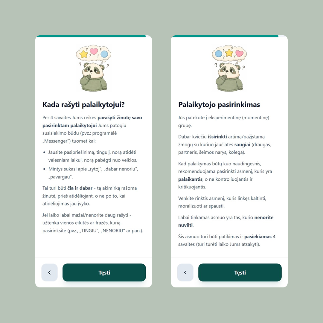
So the form does something different: it teaches the participant their assignment inside the form itself, in the last few screens before completion.
This is where the group branching starts to matter. The user in the screenshots above has landed in the momentary group — the one where they need to recruit a support person and message them when they feel the urge to procrastinate. That’s not a small ask. It’s the entire intervention being tested. If they don’t understand it, they can’t do it, and a month later their data is unusable.
So the instructions take their time. One screen explains who the support person should be — close, safe, supportive rather than critical, reachable for four weeks. The criteria are spelled out (a friend, partner, family member, colleague), and so are the anti-criteria (don’t pick someone who blames, moralizes, or pressures). The next screen explains when to message them — the moment the user feels resistance, not after the procrastination has already happened. Tai turi būti čia ir dabar.
A few things worth noting about how this is structured:
The instructions are short paragraphs with the operative words bolded — išsirinkti, palaikantis, nenorite nuvilti, čia ir dabar. A user skimming on a phone can pick up the protocol in three seconds just by reading the bold. The full prose is there for the people who want it; the bold is there for the people who don’t.
The email still goes out at the end. But it’s now a reference instead of a primary channel — a place to look something up, not the first time the user is hearing any of this. By the time it lands in their inbox, the instructions are already familiar.
Other groups get different versions of these screens. The control group’s instructions are much shorter (no support person to recruit). The weekly group gets an additional cadence to learn. The form branches one last time before the finish line, making sure each participant leaves with the right mental model of what they just signed up for.
The finish line
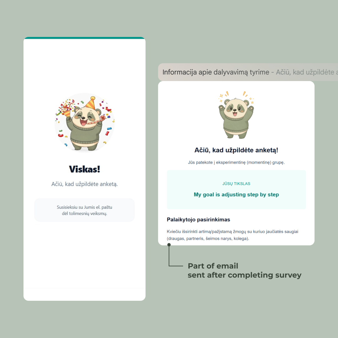
The progress bar fills. The mascot throws confetti. Viskas!
0 / 5
It’s a small celebration for a reason. The user just spent fifteen minutes doing real cognitive work — setting a goal, judging their own commitment, agreeing to message a support person every time they feel resistance for the next four weeks. That deserves more than a generic “thanks, your response has been recorded.”
The screen also sets the next expectation in one quiet line: Susisieksiu su Jumis el. paštu dėl tolimesnių veiksmų. The form is done. The study isn’t.
Notes on the emails
The emails are the thing holding the four-week gap together. Three of them go out over the course of the study, each solving a specific problem.
The two-week reminder. Halfway through, every participant gets the exact goal they set on day one pulled from the database and surfaced back at them in their own words. Not “keep going!” — the actual sentence they typed. Plus a line giving them permission to be imperfect about it. A nudge, not a guilt trip.
The final survey invite. Four weeks in. Every user gets a unique tokenized link — the token is generated after 4 weeks pass in the cron job and embedded in the URL. Clicking it authenticates them silently and drops them straight into the final survey. One less step.
The token also does authorization. The server refuses to load the form unless the token is valid, belongs to a participant who finished the first survey, and four weeks have actually passed.
The late reminder. If the final survey isn’t filled out within a week, one more email lands. After that, we stop. One nudge is where the line sits between helpful and noise.
All of it runs on Resend, pulling from the same TursoDB row the form wrote on day one. From the participant’s side, they click a link and the right thing happens. Everything underneath is doing the work of making four weeks feel like one continuous thing.
What it’s built with
A short stack, picked for speed and not getting in the way:
- SvelteKit + TypeScript for the app itself — server-rendered, route-based, type-safe end to end.
- TursoDB for storage — SQLite at the edge, fast enough that partial-save-on-every-step never felt like a tradeoff.
- Bunny.net for static assets and the mascot illustrations.
- Resend for transactional email — the two-week reminder, the final survey link, the late reminder.
Nothing exotic. The interesting work wasn’t in the stack — it was in the hundreds of small decisions about how a form should feel when the data it collects has to matter a month later.
The numbers
67 people started the survey. 47 finished the second one a month later. A 70% follow-through rate on a four-week longitudinal study — not bad for a piece of academic research with no incentive beyond contributing to a bachelor’s thesis.

The form itself did its job: drop-off inside the first survey was negligible. Where the study lost people was where every longitudinal study loses people — between the two surveys, in the four-week gap, where the only thing keeping participants engaged was the goal they’d set for themselves and (for the momentary group) the person they’d recruited to support them. Which is, of course, the thing the study was actually measuring.
The full results — whether the momentary groups actually outperformed the control, and by how much — live in Gintarė’s thesis (not yet published).
Thanks for reading this far. If you’re building something where the user has to come back, or stay motivated, or trust you enough to share something honest — I hope something in here was useful.