Every conference hands you a printed schedule when you walk in. You glance at it once, fold it into your pocket, and by 11am it’s irrelevant. The chair ran ten minutes long. The panel before lunch got cancelled. The session you actually wanted to see has moved to a different time slot and nobody told the people standing in the hallway looking at a piece of paper from yesterday.
I went to the MMC Ireland conference and watched this happen in real time. Nobody had a laptop open. Everyone had a phone. The printed programme was decoration.
So I built the thing that should have been there.
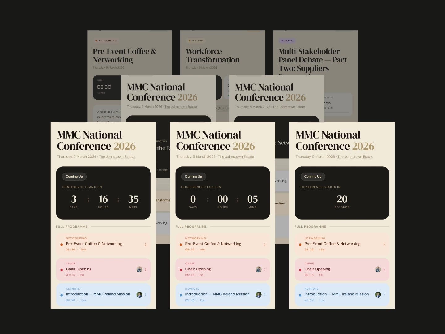
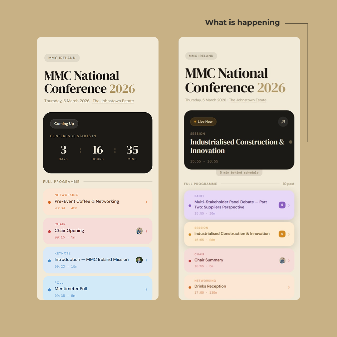
It’s a live schedule. Not a static page with times on it, but a page that knows what time it is and reacts to it. Open it during the conference and the session currently happening is highlighted. The countdown above it tells you how long is left. If the chair runs over, the schedule knows. If the next session starts late, you don’t have to ask anyone — you just look at your phone.
The whole thing is mobile-only on purpose. At the last MMC conference, nobody in the room had a laptop open. Everyone checks the schedule between sessions, standing with a coffee, one-handed.
What’s actually on the page
A few things are doing work at once:
The header has a countdown to the conference starting, and once it’s running, it flips to showing what’s live right now and what’s coming up next. The “are we ahead or behind schedule” signal is the quiet hero. It’s not a banner that yells at you. It just means the live indicator is honest about reality instead of pretending the printed times are still true.
Below that is the full programme, top to bottom. Each item has its type (Keynote, Panel, Break, Networking), its start time, its duration, and where there are speakers, their faces. Tap a session and you get the room, the abstract, and the speakers. Tap a speaker and you get their bio, their company, and if you want to connect on LinkedIn, the link is right there. No business card hunting. No squinting at a name badge from across a room.
That last part matters more than it sounds. A conference is mostly an excuse for the conversations between sessions. Making the speakers one tap away from a real connection is the part of the schedule that does the work nobody asks for but everyone needs.
The programme is a list of slots, not a list of talks
The full programme on the home screen is intentionally flat. Top to bottom, in order, one card per slot. The chair opening, the keynote, the coffee break, the session on workforce transformation, the lunch, the panel, the drinks reception. They’re all the same shape on the list because from the attendee’s point of view they all answer the same question: what’s happening at 11:15.
What they’re not is all the same underneath.
Two kinds of slots
A slot is either simple or a session.
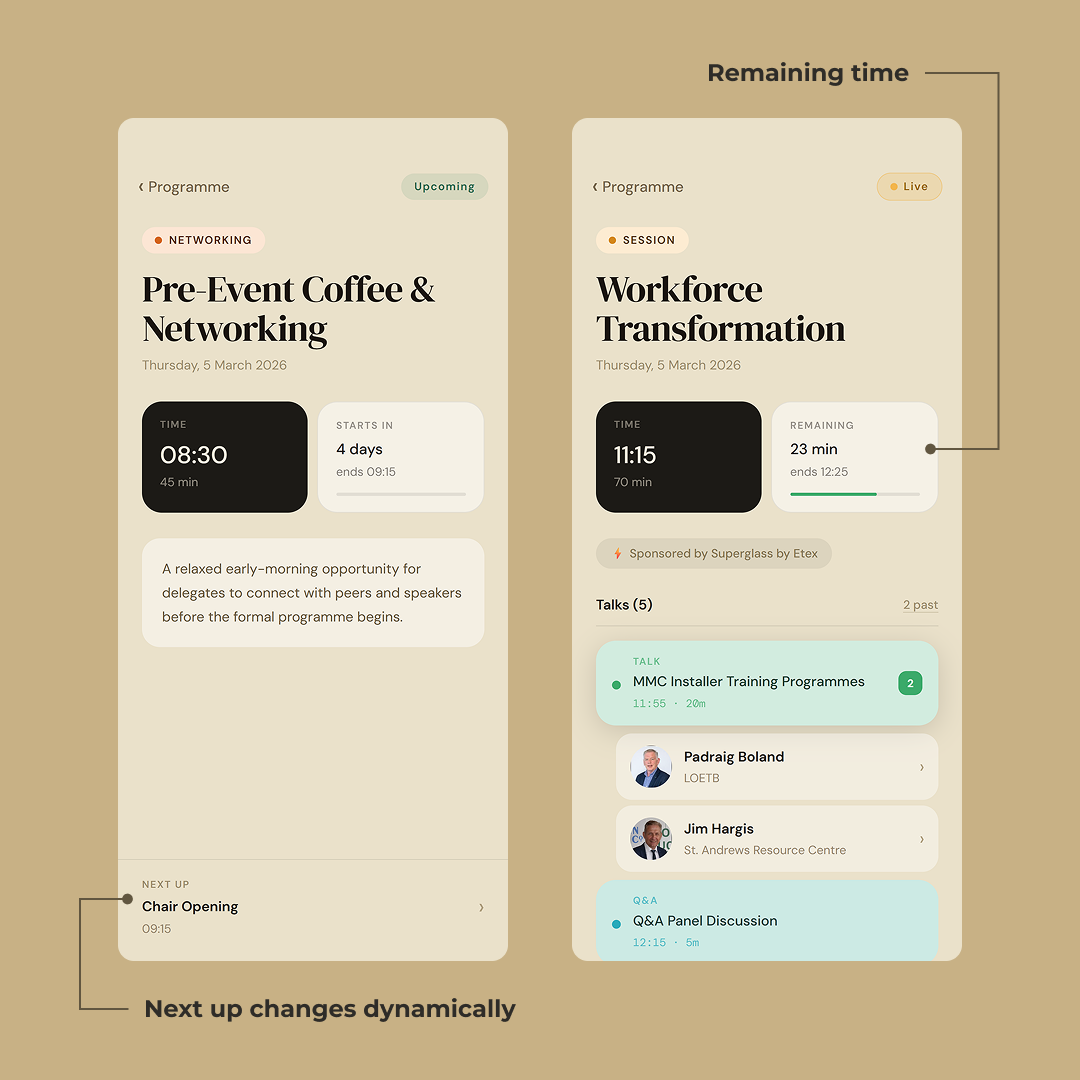
A simple slot is one thing. Coffee break. Chair opening. Lunch. The keynote is also a simple slot. One block of time, one description, maybe a speaker attached to it. Tap it and you see what it is, when it ends, who’s running it. That’s the whole story.
A session is a container. It’s a topic — Workforce Transformation, Product and System Standardisation in Construction, Industrialised Construction & Innovation — that runs for an hour or two and has multiple talks inside it, sometimes with different speakers, sometimes with a Q&A panel at the end. On the main programme it’s still a single card. You don’t see the internals until you tap in.
This was a deliberate choice. If I’d exploded every session into its individual talks on the home screen, the list would be forty items long and the rhythm of the day would be lost. You’d be scrolling past five sub-talks just to find the lunch break. The home screen is for navigating the day. The session screen is for navigating the session.
What a session detail page does
Tap into Workforce Transformation during the conference and a few things are going on at once.
The header tells you it’s live. The “Live” pill in the top right is the same colour the slot card was on the main list. Continuity, not decoration.
Below the title, two cards side by side. TIME on the left is the slot’s own clock — when it started, how long it runs. REMAINING on the right is the live one — 23 minutes left, ends at 12:25, and a progress bar that fills as the session burns down. If the conference is running behind, this is where you find out. No banner, no notification. Just an honest progress bar.
Sponsor credit gets its own row underneath. It’s there, but it’s not competing with the content.
Then the talks. The list is labelled with the count — Talks (5) — and a quiet 2 past link in the corner that lets you scroll back if you missed something. The currently-live talk is in green and lifted out of the stack visually. The number badge on the right says it’s the second talk of the session. Above it, 11:55 · 20m. Below it, the speakers attached to that talk, each one as their own row with their photo, name, and company.
The speaker rows have a chevron. Tap one and you get the bio.
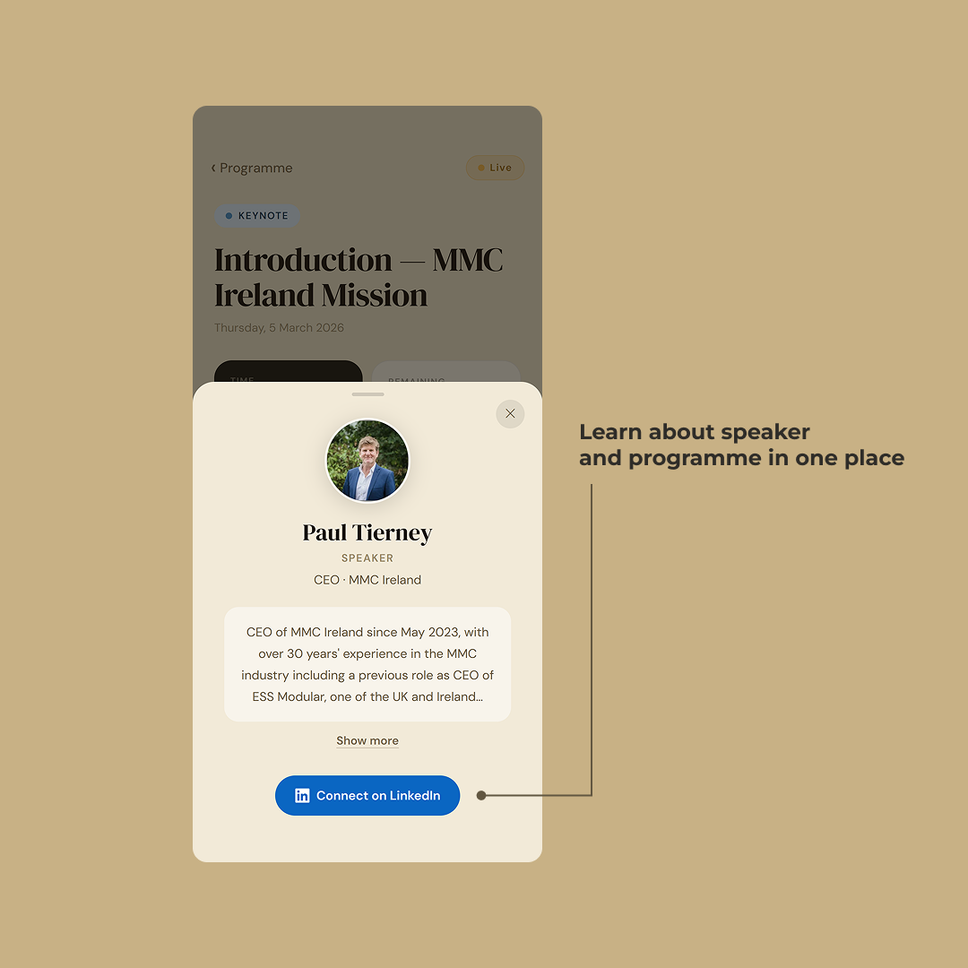
The speaker is one tap away
Tap any speaker — from a slot card, from inside a session, from a panel lineup — and the bio slides up over whatever you were looking at. The page underneath dims but stays visible. You’re not navigating away, you’re just lifting a detail into focus.
The photo is the first thing you see, and that’s on purpose. Conferences are full of people whose name you’ll forget the moment you put your phone down. The face is the anchor. If you want to find someone at the coffee break, you don’t search by name. You scroll until you recognise the face.
Below it: name, role, company. Paul Tierney. CEO at MMC Ireland. Then the bio with a Show more link if it runs long. And then the part that does the actual work — a single blue button that says Connect on LinkedIn. One tap, you’re in the app on their profile, ready to send a request.
Why this matters
Most conference sites split the schedule and the speakers into two tabs. The user does the joining in their own head.
This one doesn’t. The speaker isn’t a page, it’s an object that shows up wherever they’re relevant, and tapping them gives you the same sheet every time. You don’t go to a speakers section. You meet the speaker where they appear in the schedule.
The blue button is the whole point. You heard them speak, you liked what they said, you opened their bio, you connected. The loop closes on one screen.
Paul Tierney
SPEAKER
CEO · MMC Ireland
Paul Tierney is the chief executive of MMC Ireland, the national industry body for Modern Methods of Construction. He has spent the last decade working with gov…
The small things you actually need on the day
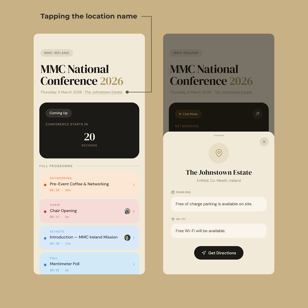
The location on the title card is a link. Tap it and a sheet comes up with the things you need when you’re already on your way: where you’re going, where to park, whether there’s Wi-Fi, and a button that drops you straight into your maps app for directions.
That’s it. No address copy-paste. No googling “Johnstown Estate parking”.
These are the questions that come up at exactly the wrong moment — sitting in traffic on the M4, walking from the car park looking for the entrance, trying to load the schedule on 3G before the venue Wi-Fi kicks in. Burying them three taps deep in a footer would have missed the point. They sit one tap from the title.
The stack, briefly
SvelteKit + TypeScript — server-rendered, route-based, type-safe end to end.
Bunny.net — hosting and edge delivery for the whole site.
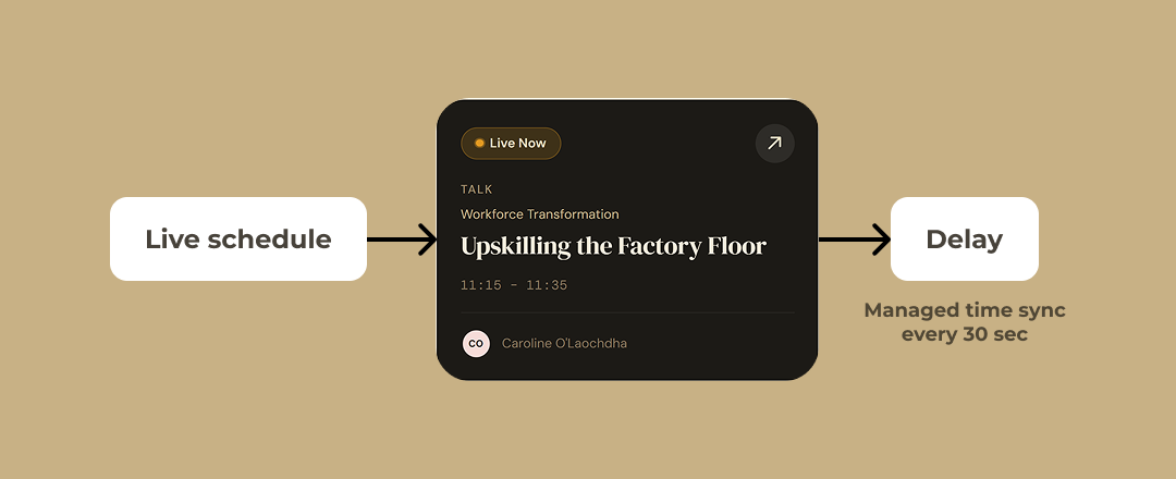
Bunny Edge Scripting — a small script at the edge that reads an environment variable and offsets every time on the schedule by that amount.
The delay handling is the one bit worth explaining. The schedule’s “live” state is calculated from the current time against the published times. If the chair runs ten minutes long, the published times are now a lie and every live indicator on the page is wrong.
The fix is one environment variable. A delay offset in minutes, read at the edge, applied to every time the page renders. On the day, if things slip, I change the value remotely and every phone in the room updates on the next page load. No deploy. No build. No coordination.
That’s the whole live-correction mechanism. One number, changed in one place, applied everywhere.
What this was, really
A conference doesn’t need an app. It doesn’t need a paper schedule either. It needs a URL that knows what time it is.
That’s the whole project in one line. Everything else — the live progress bars, the session-as-container model, the speaker sheets, the venue details one tap from the title — is in service of that idea.
The schedule is the conference. When it’s live, it tells you what’s happening now and how long is left. When you tap a session, it shows you the talks inside it and which one is on stage. When you tap a speaker, you get their face, their bio, and a blue button straight to LinkedIn. When you tap the venue, you get parking, Wi-Fi, and directions. Same page, three states, one source of truth.
Built mobile-only because that’s what people actually use in the room. Built around live state because a printed schedule is wrong by 11am. Built so the speaker and the slot and the venue all live on the same surface, because making someone hop between tabs to join two pieces of information is the kind of friction that adds up across 400 people and one long day.
Nothing in the project is technically exotic. The interesting work was in deciding what the page should emphasise depending on the time of day, and trusting that a quiet progress bar does more than a banner ever would.
A conference is mostly the conversations between the talks. The schedule’s job is to get out of the way of those conversations and, where it can, start them.